
Investor Strategy
5 October 2026
Proceed with caution
Sign up here to receive the Investor Strategy by email.
Bond blues
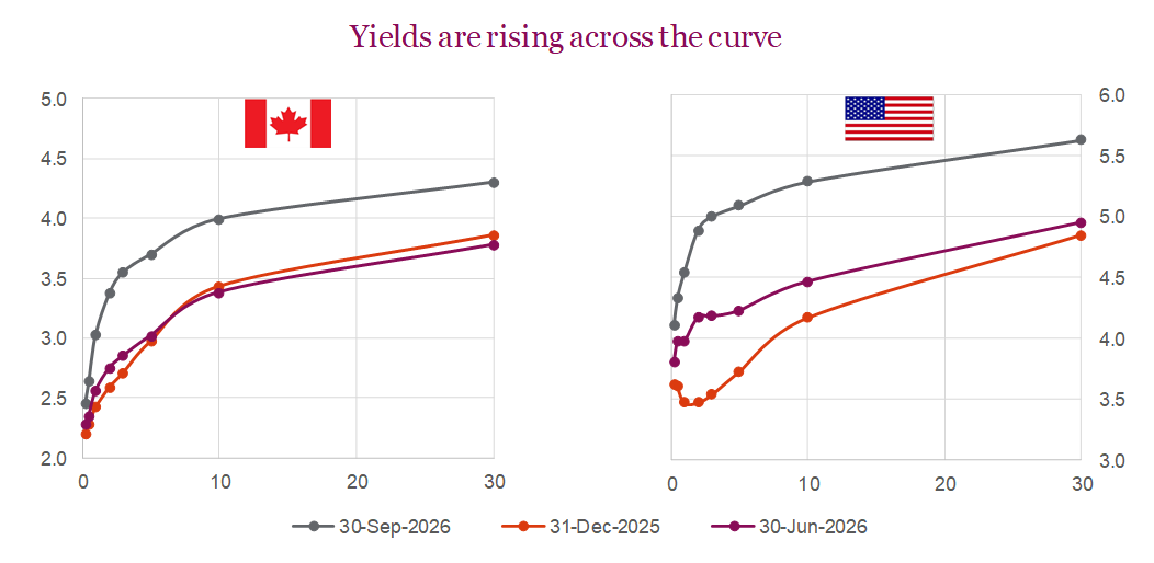
September was a volatile month for bonds, as inflation, resilient economic activity in the U.S., and escalating geopolitical tensions pushed global bond yields higher. The Fed raised its policy rate by 25 bps to 3.75–4.00%, while stronger-than-expected U.S. employment, consumer spending, and inflation data reinforced expectations that the central bank will need to hike further later this year. Treasury yields in the U.S. rose across the curve, with the 2-year and 10-year yields each climbing roughly 54 bps during the month, while the 30-year yield approached levels not seen since 2002. Higher energy prices added to inflation concerns as the U.S.-Iran conflict disrupted global supply and pushed oil prices higher. When it was all said and done, the U.S. Aggregate Bond Index was down -2.61% for the month while the Canadian aggregate bond index fell -1.20%, with both indexes now negative YTD.
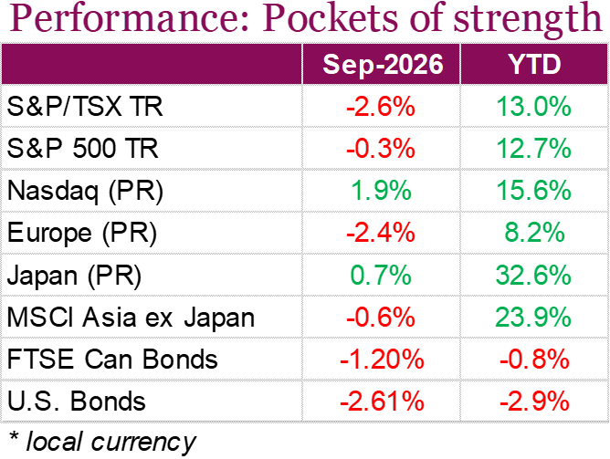
Equity markets were mixed in September as rising yields weighed on most regions, although strength in technology was a tailwind for U.S. equities. The S&P 500 finished the month down -0.5%, while the Nasdaq was up 1.93%, helped by continued enthusiasm around AI and strong momentum among large-cap tech companies (more on this later). Canada didn’t fare as well, with the S&P/TSX declining -2.9%, weighed down by weakness in financials, energy, and materials. The index’s relatively small tech weighting also contributed to the divergence from U.S. markets. European equities also struggled as higher energy costs, rising yields, and political uncertainty weighed on sentiment, while emerging markets faced headwinds from higher U.S. rates and a stronger U.S. dollar. Japan proved to be one outlier, with the Nikkei 225 advancing 0.7%.
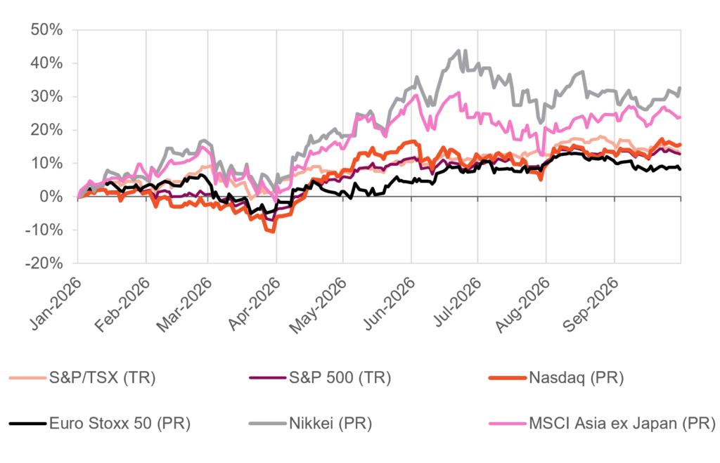
While inflation, higher energy prices, and elevated government borrowing could keep interest rates higher for longer, the market outlook remains constructive as we head into October, historically one of the most volatile months of the year. One source of support is the strength of corporate earnings, with S&P 500 earnings expected to grow 29.1% year over year in the third quarter, while the number of companies issuing positive guidance is well above historical averages, suggesting corporate fundamentals remain healthy. In Canada, the economic backdrop remains softer, although subdued growth could help contain underlying inflation pressures and reduce the need for the Bank of Canada to tighten policy as aggressively as markets currently anticipate.
Stealth bear
The largest development concerning markets over the past month has been the continuous rise in bond yields. The U.S. 10 year has risen to around 5.3%, eclipsing the 2023 highs and reaching levels last seen when Don Draper was fast becoming a household name (hint 2007). Interestingly this was also where yields peaked prior to the financial crisis. Unlike other periods of surging bond yields, markets are largely taking this latest run-up in strides. The S&P 500 is playing it cool, off just a few percent from all-time highs. Like Don Draper, old fashioned in hand in a freshly tailored suit, the index projects strength, and an image of resilience that completely masks a deteriorating foundation and turmoil within. A closer look at market breadth reveals an internal growing divergence between the average stock and what you see in headline returns.
Market breadth is a broad term to describe the numerous ways to slice and dice the market to gauge market participation. Strong breadth is generally considered to be a healthier market, while narrow breadth indicates worsening internal participation. One of the more common gauges is the percent of index members trading above key moving averages such as the 50 and 200 day. As we write, just 44% are trading above their 200-day moving average, and 23% above the shorter-term 50-day moving average. This is extremely low, and quite rare to have such poor breadth with the index just shy of its highs. We typically see these levels during corrective events, not just shy of the highs. If history is to be a guide, this type of setup typically resolves itself with prices moving down to breadth rather than breadth catching up to price.
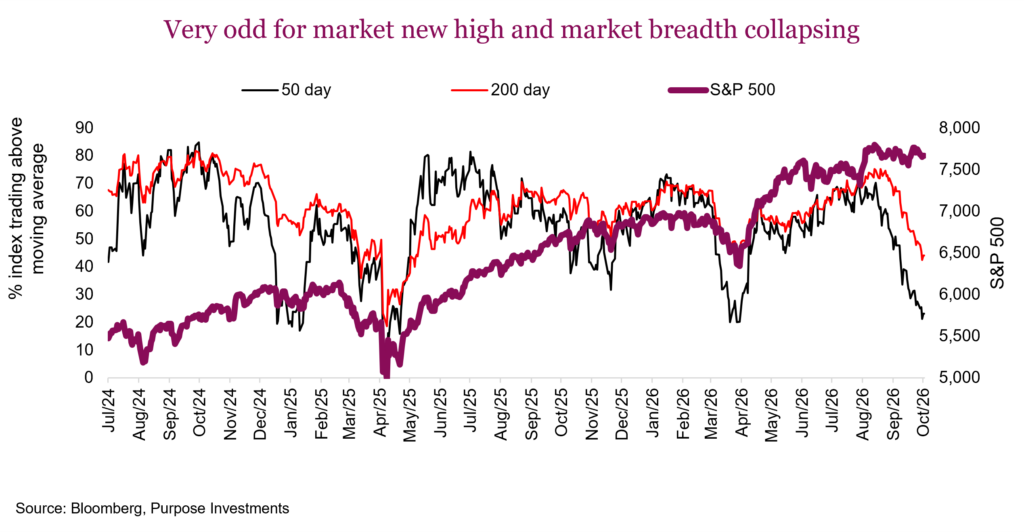
Other breadth stats – Like baseball commentators, market strategists can surprise you with novel statistics. New to us this week was the Goepfert stat (don’t worry, we’ve never head of this before either). The S&P 500 recently rallied at least 1% of a record, while more stocks hit new lows than new highs. This has only occurred on two other days in history: July 23, 1929, and December 21, 1999. Both instances came a few months before major market tops. Chilling, and with a sample size of two, it should be taken with a grain of salt. It’s more cocktail hour fodder, rather than market signal.
Other more conventional breadth measures are showing the same thing. The NYSE Advance/Decline line peaked on August 14th, and has been falling for six weeks. Internals have been deteriorating for six weeks, and the most recent comparable episode with the index this close to a high was July 2015, which eventually resolved itself with a correction.
Heavy hitters – Over the past month, nearly all sectors in Canada and the U.S. were in the red. The lone exceptions were technology and communication services in the U.S. which is basically a tech ride along. Concentration risk is real however, those concentrated sectors are the only ones working at the moment, and that is precisely why the index looks fine.
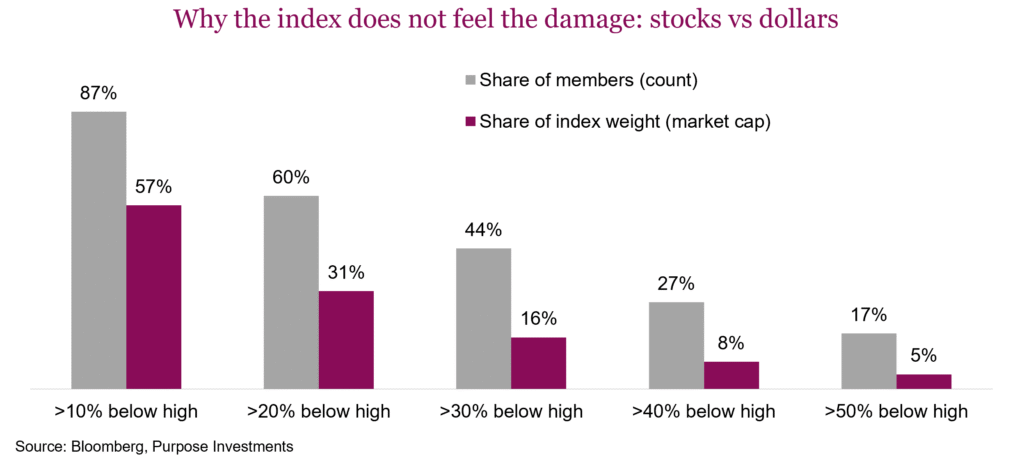
The majority of companies in the S&P 500 (60%) are already in a structural bear market, more than 20% below their all-time highs. This is a bear market for the average stock hiding in plain sight. That bucket is only 31% of the cap weighted index. At the other end, just 66 stocks sit within 10% of their high. They are 13% of the members, but 43% of the weight. We see this same divergence in each drawdown tranche in the chat below. There is a stark difference in the share of members experiencing substantial drawdowns versus the index weight.
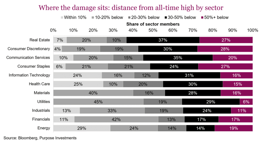
Digging a little deeper, the chart below breaks down the same drawdown tranches by sector. The damage is deepest in rate-sensitive sectors. Roughly three quarters of real estate, consumer discretionary and consumer staples members are more than -20% below their all-time highs, and in real estate close to two thirds are more than 30% below. Staples, a sector investors normally look to for stability, has 27% of its members more than -50% off their highs. At the other end, energy and financials are the only ones where fewer than half the members are in a 20%+ drawdown. Technology is split in two. A quarter of its members sit within 10% of a record while 47% are down -30% or more. It just so happens that the quarter near the highs carry most of the index weight. This year only energy (+37%) and technology (+28%) are beating the S&P 500 (+12.7%) and only 35% of members are ahead of the index. Dispersion this wide should favour active managers; however, it is tougher when fundamentals are not driving the dispersion but sheer size, rate sensitivity, and whether a company is deemed an AI winner or loser are the determining factors.
Portfolio implications – Falling breadth is not automatically bearish. The best buying opportunities of the past 35 years all arrived when breadth was terrible, because price was already down. Breadth this weak with price still at the highs is a different animal, and a historically worrisome one. Breadth alone should never be used for market predictions; however, it is alerting investors to proceed cautiously. Digging into the internals reveals more of a rate-driven dispersion rather than a growth scare. Rate sensitives have been hit hardest. Credit spreads, volatility and earnings revisions all disagree with the breadth bears. For now, the macro backdrop is calm, earnings growth is strong, and the economy is still humming.
In terms of how the poor breadth is impacting portfolios, income mandates are being acutely impacted. The current environment is hard not only for traditional fixed income but also for dividend portfolios carrying excess rate sensitivity. Weak internals don’t last forever, eventually something has to give. Given the degree of drawdown in many of the rate- sensitive sectors, valuations are becoming more attractive. The signs are clear: market fragility has risen, so we’re proceeding cautiously. If yields reverse, expect this to be the first catalyst for breadth to broaden, and we’d expect the beaten down rate sensitives to rebound appropriately. But now to dig deeper into the dividend space.
Cyclical yield
So, we have a market that is holding up at the index level but underneath the surface most companies are simply performing rather poorly. For the S&P 500, 23% of index members are trading above their 50-day moving average. Fortunately, the megacaps are largely in that 23% and performing well, given their heft in the capweighted index and we have a market that is holding up. Same thing is happening in Canada with the TSX. Only 26% of members are above their 50-day moving average. Mitigating the impact on the headline index number isn’t technology, although it is helping, it is more so energy and materials. More economically cyclical parts of the market are doing well largely because economic optimism has been on the rise and supply disruptions continue.
In the dividend space this is causing massive divergence. More interest rate-sensitive dividend payers such as utilities, pipelines and real estate are really struggling with these higher yields. But more economically cyclical dividend-paying companies are doing much better. Cyclical yield was a framework that was developed to differentiate among dividend-paying companies based on their sensitivity to yields. Interest rate sensitives are in sub-industries that are correlated more so to changes in yields. Often these are the ones bucketed in the term ‘bond proxies’. Cyclical yield dividend payers are less sensitive to changes in yields usually because they are more sensitive to changes in economic activity, hence the term ‘cyclical’.
In the following chart we have charted the relative performance of cyclical yield industries vs interest rate sensitives. A rising line implies cyclical yield is outperforming. It is both intuitive and it works. As bond yields fell from 2010 to 2020, interest rate sensitives were the winners among dividend-paying companies. But since 2020, it has been cyclical yield. As a result, portfolios with more cyclical yield have been doing better as yields move higher.
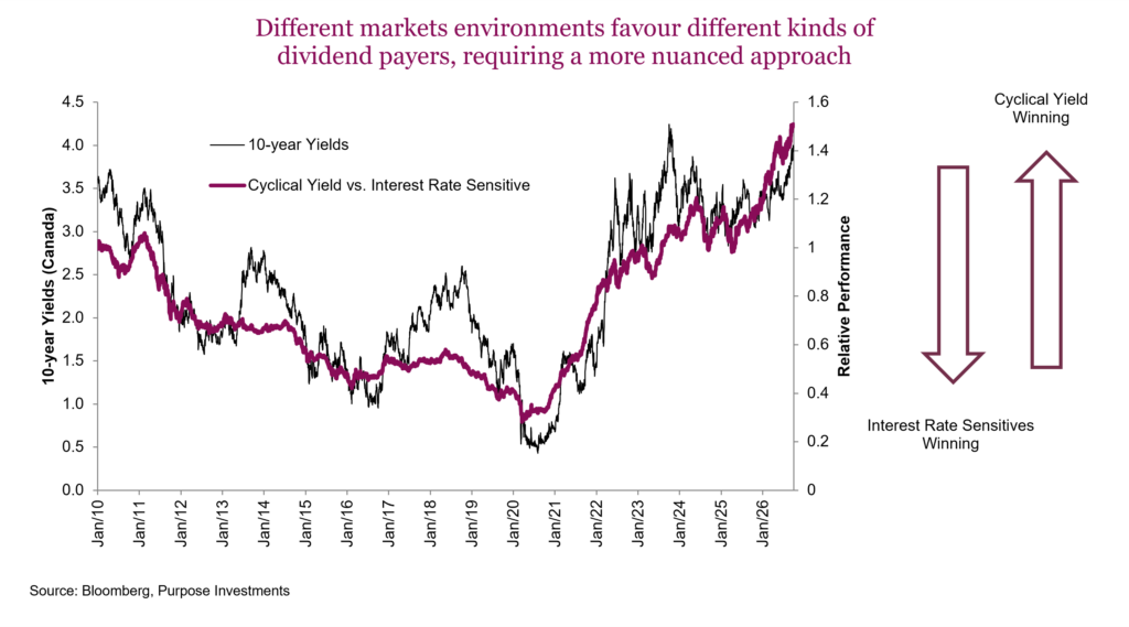
Going forward, things get a bit more complicated. The above line is relative performance — we should point out that while interest rate sensitives have lagged, they are still up over the past few years. Just not as much, and have seen a dip with this latest rise in bond yields. What is starting to look interesting is the interest rate sensitives that have historically traded with a slight premium valuation to the overall TSX are now roughly inline. Meanwhile, the average valuation among cyclical yield industries fluctuates a lot but has certainly risen of late.
We are still fans of cyclical yield over interest rate sensitives, but this view is starting to moderate as we are seeing some enticing value and improved risk/return potential among interest rate sensitives.
Market cycle
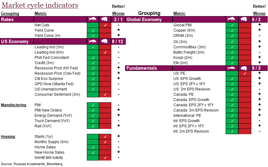
Folks are pretty bent out of shape over this rise in yields and it is certainly a risk. But it is not all bad news. For one, equity markets are up this year, and bonds are now flat to slightly negative — isn’t that kind of how it is supposed to work? Plus, while these yields have moved higher due to a number of factors, the dominant factor appears to be rising economic activity. That is one of the reasons markets have held up — higher bond yields driven by better economic data is perhaps one of the best reasons for bond yields to rise.
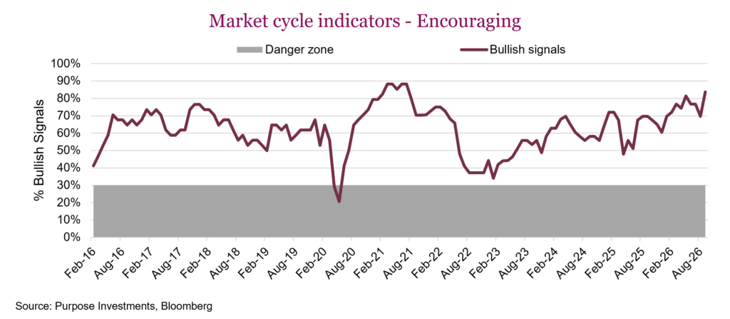
Not surprising, the better economic data is translating into a leg higher in the market cycle indicators. These cover economic data for the U.S. and global economy, plus valuations, earnings and rates. The only soft spot at the moment is U.S. housing, one of the parts of the global economy that is most sensitive to higher yields. Otherwise, it is pretty much a good news story everywhere.
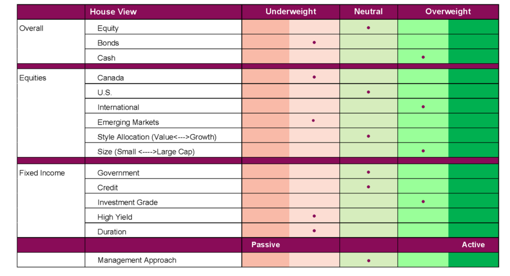
No change to our allocations over the past month. We remain about neutral on equities, largely because of the strong run already enjoyed. We are a bit underweight on bonds and holding extra cash. Among equities we have a bit of an underweight in Canada and overweight internationally, with neutral tilt on the U.S. side.
Portfolio positioning
Final thoughts
Solid economics and earnings are helping these markets manage higher yields and other macro concerns. But with breadth this weak, perhaps the market is starting to show some signs of strain after so many years of strong performance. Don’t get all bearish though, earnings season kicks off soon and the last one was a gangbuster. This could help provide more fundamental support for the market, and some lower yields would help too.